Category: Q&A — Published:
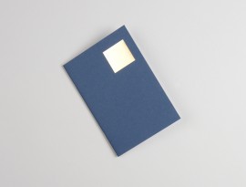
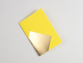
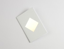
Whitechapel Gallery: Your postcards and pocketbooks illustrate an imperfect square tumbling across the paper. Tell us how Adventures of the Black Square: Abstract Art and Society 1915 – 2015 inspired you to create this design. Did any particular artwork play a key role in the design process?
Pete Thomas: Well we really like Malevich work and that had quite a big influence on us. A lot of the time we try and strip our work right back to the simplest form we can whilst still making something that feels like a piece of work that you could recognize as being our work. In this case it was an exploration of how a simple square can change across the page – how the book changes as the square grows and tumbles. The smallest square positioned top right feels very traditional and discreet, while the largest square running across the spine of the notebook is quite bold.
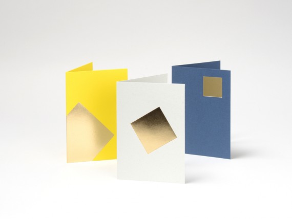
WG: Why an ‘imperfect square’?
PT: There’s a warmth and organic quality to many of the pieces in the exhibition, a reminder that whilst they are geometric they have also been made by hand. This is evident in our work because of the signs created by the production process, such as the marks left when we hand polish the pieces or the slight imperfections in the foiling process. The imperfect square is an extension of this thinking.
WG: The colours you’ve chosen feel very modern and industrial. Tell us a bit about the colours that feature on the postcards and why you have chosen to use ‘petrol blue’, ‘concrete grey’ and ‘chrome yellow’.
PT: We were drawn to the earlier pieces, many of which reflected the rise of the machine age and large scale industrialization and often worked with a primary colour palette.
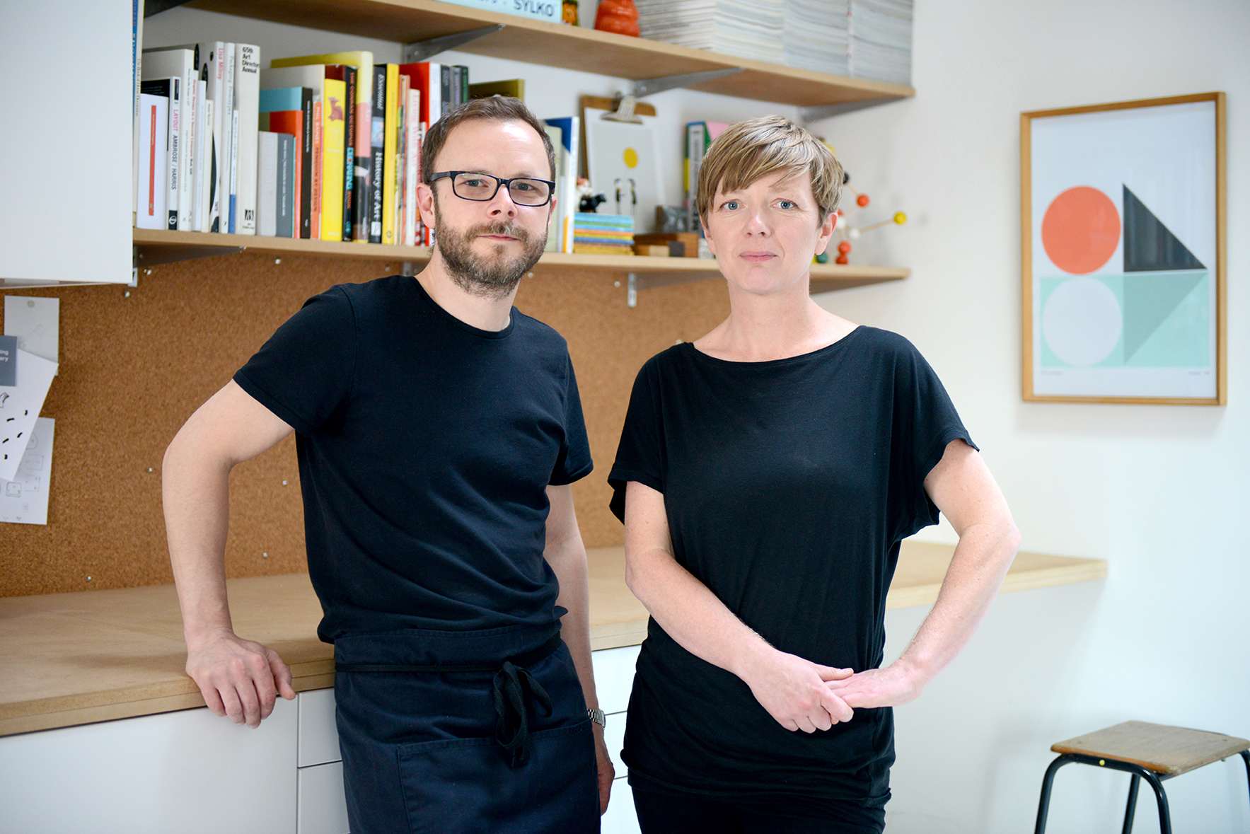
WG: How did you come to design jewellery? What people, themes or topics influence your work?
PT: We’re not really jewellery designers just designers – we try to work across disciplines. Our background is pretty diverse. We have always been inspired by mid 20th Century designers like Charles & Ray Eames and Eero Saarinen. At that point in time there was a real sense that designers could move fluidly across disciplines, which I think stretches back to the Bauhaus philosophy. Conran was a big influence on us growing up and the design of stuff like Penguin books in the 1960s and 70s – I think in general there is a broad theme here of Modernity that influences what we do, although at the moment we’re having some fun challenging our seriousness by embracing a little postmodern playfulness.
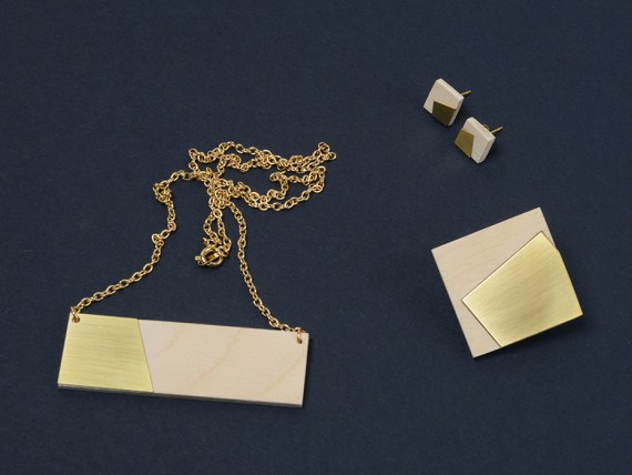
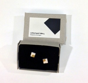
WG: You’ve chosen to leave the brass finish on some of the jewellery items uncoated… Why have you chosen to do this?
PT: We try to take advantage of the inherent aesthetic qualities of the materials we use. Brass ages beautifully and the patina that develops on each piece is unique to each wearer. We think the pieces are more interesting when they are slightly worn-in. By leaving it uncoated we give the wearer the choice to allow it to age or to maintain it’s original appearance. In the case of the pieces for Adventures of the Black Square we particularly wanted to reflect the warm, organic quality of some of the early 20th Century art in the exhibition.
WG: You cut, finish and assemble each piece of jewellery in your studio on the East Coast of Scotland, tell us about the mechanics of this process and how the creation of hand-assembled jewellery could be similar to the way an artist chooses to assemble a painting, sculpture or photograph?
PT: The day-to-day making of our jewellery is much more of a design process that an art process. It’s essentially very small-scale batch production and we like this aspect of it; that we are making multiples and making them affordable, as this creates a set of (sometimes difficult) constraints that we need to work within. At the start of the development of each piece or range we go through an experimental process of developing and exploring ideas which is the really creative part of the process and this is very similar to the way an artist might work – getting inspired, exploring ideas, testing approaches, getting messy and making mistakes!
WG: In the past, you’ve said that in designing the jewellery items, you wanted to create something “strikingly simple and minimal whilst still making pieces that are easy and enjoyable for people to use and wear”. Could you comment on whether you think the growing trend of geometric abstraction in jewellery and fashion trends has made abstract art more accessible.
PT: I think it has commodified abstract art. What people struggle with sometimes is the idea that something that can appear very simple or something that can be reproduced easily can also be very expensive. Abstraction in the applied arts has been accepted for a long time – think of wall paper or fabric patterns – what makes them easier to accept is their price.
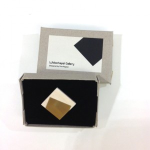
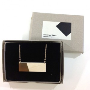
The collection is available to purchase through our online shop or at the Bookshop. Adventures of the Black Square: Abstract Art and Society 1915 – 2015 is on display until 6 April 2015.